Datto Labs Branding
Client: Datto
BRANDING, DESIGN, AND ANIMATION: SARAH TALBOT
2021
Problem:
Datto needed to drive organic traffic to its site by providing specific and easy-to-find technical resources for partners and product users.
Approach:
Datto’s video team determined that a new, separate video series on Youtube would be the best tool to create short form, technical tutorials and explainers for product users. Since the Content could vary widely by topic, I wanted to develop a brand that was modern, product agnostic, and stood apart from the corporate Datto branding. With these goals in mind, I wanted to achieve a video brand that fostered a learning community, instead of appearing as a standard Datto marketing advertisement.
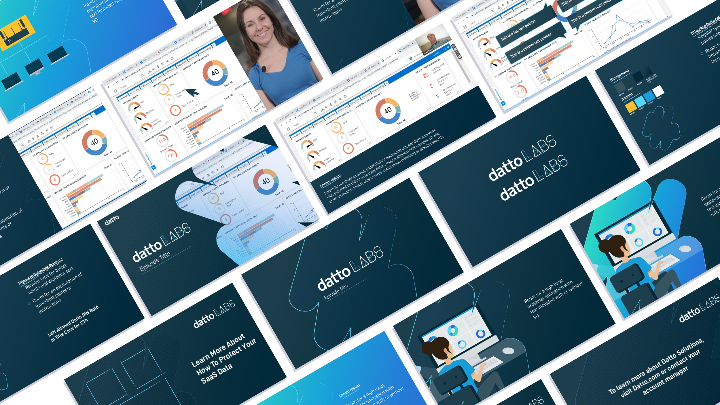
Although the video topics would vary, I unified the brand through the design of a standard presentation template as well as motion graphics design templates. Presentation designers and editors used the templates and brand guidelines
I developed the visual concepts around the idea of “getting back to the drawing board.” Using textural elements such as graph paper and blue pencil sketches, I wanted to evoke the idea of looking at a product from a technical level, like a blueprint. The dark color scheme and boxy-pixelated transitions reflect the digital nature of IT, and keep the brand grounded in a modern aesthetic.
Brand Guide


Template Examples
The Datto Labs logo animation adds a sense of playfulness to the concept of “working at the drawing board.” I wanted to create an animation that reflected Datto’s inviting and personable voice as well as the simplicity of following these short product walkthroughs.
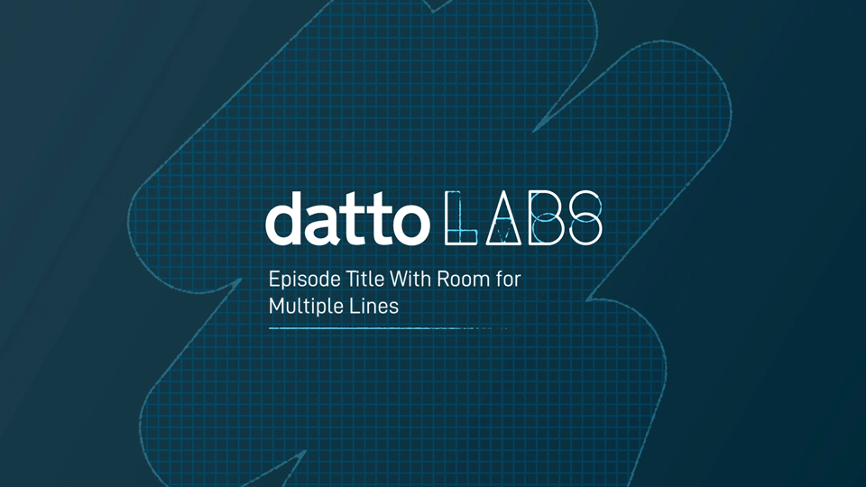
The final title screen template uses dynamic text to control the size and location of the pencil underline so that it will always be located under the title and using the same width as the title.
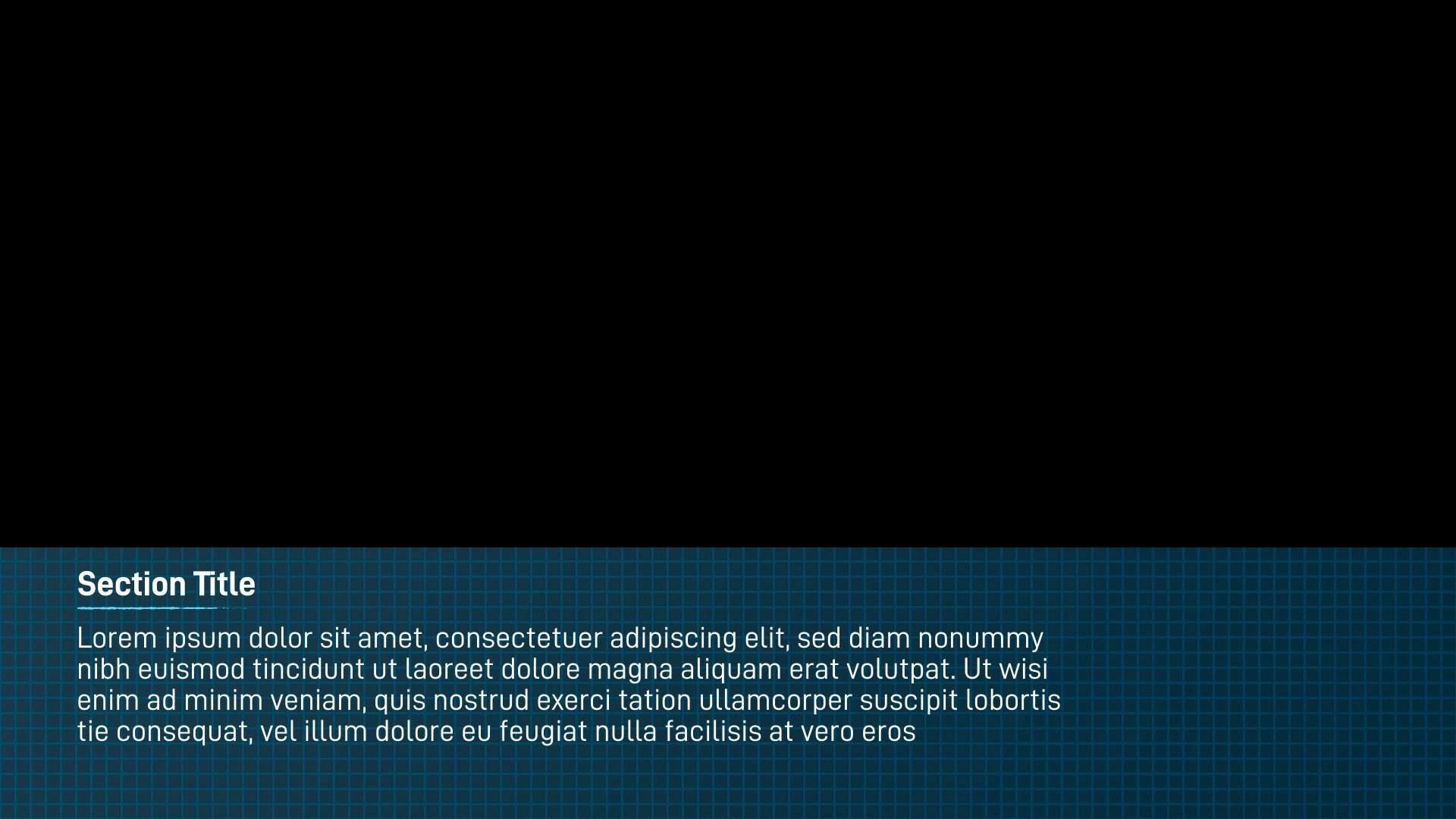
The lower third section doubles as both a name card and as a pup-up for additional text that may take up a paragraph in length. The graphics transition on and off are dynamic, and can be controlled by the editor in Adobe Premiere.
I designed the wipe transition to reflect both the digital and physical texture aspects of the brand. The pixelated dissolve acts like an eraser, as well as a glitch. The graph paper grid grounds the texture in realism, but the bright teal highlights evoke the bright lights of a computer screen.

The callouts are designed to be used when the editor wants to draw focus to an element on screen, such as an important button in the product UI. Each callout scales dynamically to the size of the input text. Editors also have the option to control the location and length of a segment of highlighted text to add further emphasis.
Branding Process

Logo Development
I created several options for the initial logo concept. I wanted to speak directly to developers and product users, blend with other Datto video series, and emphasize the educational goals of the video series.
The first concept matched similar logo layouts of other video series, such as the “Datto Community” logo in the top left of the example. However, I chose iconography that reflected development tools figuratively and literally, creating a type layout that recalled how a function might be formatted in a piece of code.
I designed the second concept to broadley reflect the digital aspect of the labs. Building text out of a blocky 8-bit pattern, I wanted to reflect Datto’s approachability and playfulness by evoking the idea of 8-bit video games.
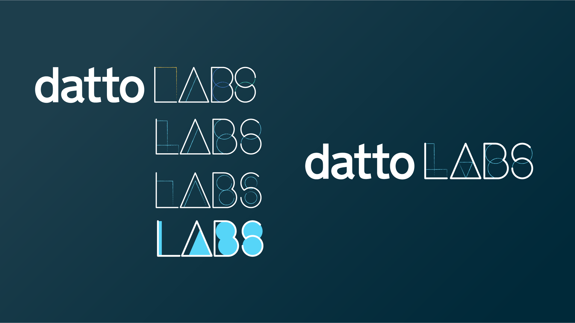
For the final logo, I drew from the aspects of the series that focused on education and approachability. By building the word “Labs” out of simple shape primitives, I wanted to show that the series would break its explanations down into easy parts. I used Multiple layers of color tracing out the shapes to create functional contrast and suggest the idea of architectural drawings or mathematical chalkboard diagrams.
We chose the “Drawing Board” concept, for its incorporation of expressive textural elements that reflected the educational purpose of the series.. We moved away from the literal concepts of digital pixels and coding so that the brand could expand beyond a developer audience.
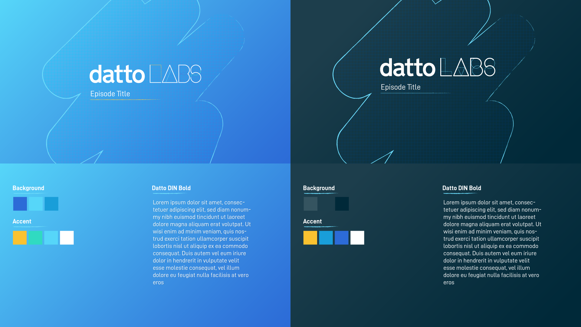
Color Scheme Explorations
I proposed two possible color schemes based on Datto’s corporate brand. The light blue theme matched more directly to Datto’s color palette and created a welcoming mood through the use of bright color accents.
However, the dark blue color scheme offered more legibility for text by creating a higher contrast between the dark background and the bright color accents. Further, the high contrast matched color palette emphasizes the “digital” world within the brand as bright color accents appear to glow on screen